Data Visualization with Pandas and Matplotlib
# import library
import pandas as pd
import matplotlib.pyplot as plt

# display plot in the notebook
%matplotlib inline

# set figuresize and fontsize
plt.rcParams['figure.figsize'] = (8,6)
plt.rcParams['font.size'] = 14
# read data
drink_cols = ["country", 'beer', 'spirit', 'wine', 'liters', 'continent']
drinks = pd.read_csv("../data/drinks.csv", header=0, names=drink_cols, na_filter=False)
Data Exploration
# examine first few rows
drinks.head()
| country | beer | spirit | wine | liters | continent | |
|---|---|---|---|---|---|---|
| 0 | Afghanistan | 0 | 0 | 0 | 0.0 | AS |
| 1 | Albania | 89 | 132 | 54 | 4.9 | EU |
| 2 | Algeria | 25 | 0 | 14 | 0.7 | AF |
| 3 | Andorra | 245 | 138 | 312 | 12.4 | EU |
| 4 | Angola | 217 | 57 | 45 | 5.9 | AF |
# observations and columns
drinks.shape
(193, 6)
# data structure
drinks.info()
<class 'pandas.core.frame.DataFrame'>
RangeIndex: 193 entries, 0 to 192
Data columns (total 6 columns):
 #   Column     Non-Null Count  Dtype
---  ------     --------------  -----
 0   country    193 non-null    object
 1   beer       193 non-null    int64
 2   spirit     193 non-null    int64
 3   wine       193 non-null    int64
 4   liters     193 non-null    float64
 5   continent  193 non-null    object
dtypes: float64(1), int64(3), object(2)
memory usage: 9.2+ KB
# numerical summary
drinks.describe()
| beer | spirit | wine | liters | |
|---|---|---|---|---|
| count | 193.000000 | 193.000000 | 193.000000 | 193.000000 |
| mean | 106.160622 | 80.994819 | 49.450777 | 4.717098 |
| std | 101.143103 | 88.284312 | 79.697598 | 3.773298 |
| min | 0.000000 | 0.000000 | 0.000000 | 0.000000 |
| 25% | 20.000000 | 4.000000 | 1.000000 | 1.300000 |
| 50% | 76.000000 | 56.000000 | 8.000000 | 4.200000 |
| 75% | 188.000000 | 128.000000 | 59.000000 | 7.200000 |
| max | 376.000000 | 438.000000 | 370.000000 | 14.400000 |
Histogram: show the distribution of a numerical variable
# sort the beer columns and split it into 3 groups
drinks.beer.sort_values().values
array([  0,   0,   0,   0,   0,   0,   0,   0,   0,   0,   0,   0,   0,
         0,   0,   1,   1,   1,   1,   2,   3,   5,   5,   5,   5,   5,
         6,   6,   6,   6,   8,   8,   8,   9,   9,   9,   9,  12,  13,
        15,  15,  16,  16,  17,  18,  19,  19,  20,  20,  21,  21,  21,
        21,  22,  23,  25,  25,  25,  25,  26,  28,  31,  31,  31,  31,
        32,  32,  34,  36,  36,  36,  37,  42,  42,  43,  44,  45,  47,
        49,  51,  51,  52,  52,  52,  53,  56,  56,  57,  58,  60,  62,
        62,  63,  64,  69,  71,  76,  76,  77,  77,  77,  78,  79,  82,
        82,  85,  88,  89,  90,  92,  93,  93,  98,  99, 102, 105, 106,
       109, 111, 115, 120, 122, 124, 127, 128, 130, 133, 140, 142, 143,
       144, 147, 149, 149, 152, 157, 159, 162, 163, 167, 169, 171, 173,
       185, 188, 192, 193, 193, 194, 194, 196, 197, 199, 203, 206, 213,
       217, 219, 224, 224, 225, 230, 231, 233, 234, 236, 238, 240, 245,
       245, 247, 249, 251, 261, 263, 263, 270, 279, 281, 283, 284, 285,
       295, 297, 306, 313, 333, 343, 343, 346, 347, 361, 376])
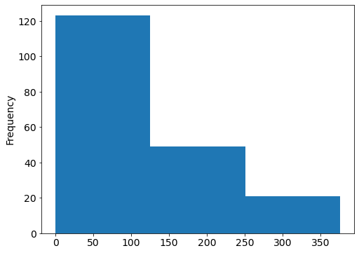
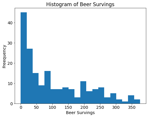
# compare with histogram
drinks.beer.plot(kind="hist", bins=3);
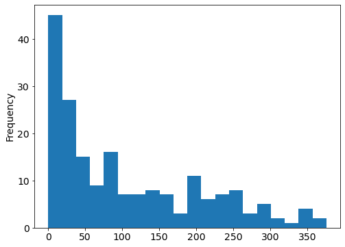
# try more bins
drinks.beer.plot(kind="hist", bins=20);
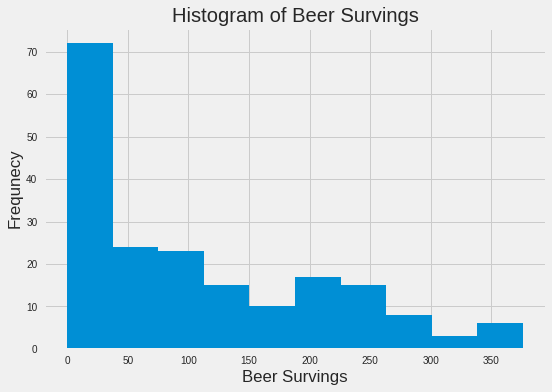
# add title and labels
drinks.beer.plot(kind="hist", bins=20, title="Histogram of Beer Servings")
plt.xlabel("Beer Survings")
plt.ylabel("Frequency")
# show plot
plt.show()
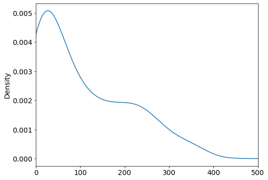
# compare with density plot(smooth version of a histogram)
drinks.beer.plot(kind="density", xlim=(0, 500));
Scatter Plot: show the relationship between two numerical variables
# select the beer and wine columns and sort by beer
drinks[["beer", "wine"]].sort_values(by="beer").values
array([[  0,   0],
       [  0,  74],
       [  0,   0],
       [  0,   0],
       [  0,   0],
       [  0,   0],
       [  0,   0],
       [  0,   0],
       [  0,   0],
       [  0,   0],
       [  0,   0],
       [  0,   0],
       [  0,   0],
       [  0,   0],
       [  0,   0],
       [  1,   7],
       [  1,   1],
       [  1,   4],
       [  1,   1],
       [  2,   0],
       [  3,   1],
       [  5,   0],
       [  5,   0],
       [  5,  16],
       [  5,   1],
       [  5,   0],
       [  6,   1],
       [  6,   0],
       [  6,   1],
       [  6,   9],
       [  8,   0],
       [  8,   1],
       [  8,   1],
       [  9,   2],
       [  9,   0],
       [  9,   7],
       [  9,   0],
       [ 12,  10],
       [ 13,   0],
       [ 15,   3],
       [ 15,   1],
       [ 16,   5],
       [ 16,   0],
       [ 17,   1],
       [ 18,   0],
       [ 19,  32],
       [ 19,   2],
       [ 20,   0],
       [ 20,  31],
       [ 21,  11],
       [ 21,  11],
       [ 21,   5],
       [ 21,   1],
       [ 22,   1],
       [ 23,   0],
       [ 25,   8],
       [ 25,  14],
       [ 25,   2],
       [ 25,   7],
       [ 26,   4],
       [ 28,  21],
       [ 31, 128],
       [ 31,   6],
       [ 31,  10],
       [ 31,   1],
       [ 32,   4],
       [ 32,   1],
       [ 34,  13],
       [ 36,  19],
       [ 36,   5],
       [ 36,   1],
       [ 37,   7],
       [ 42,   2],
       [ 42,   7],
       [ 43,   0],
       [ 44,   1],
       [ 45,   0],
       [ 47,   5],
       [ 49,   8],
       [ 51,  20],
       [ 51,   7],
       [ 52,   2],
       [ 52, 149],
       [ 52,  26],
       [ 53,   2],
       [ 56, 140],
       [ 56,   1],
       [ 57,   1],
       [ 58,   2],
       [ 60,  11],
       [ 62,  18],
       [ 62, 123],
       [ 63,   9],
       [ 64,   4],
       [ 69,   2],
       [ 71,   1],
       [ 76,   8],
       [ 76,   9],
       [ 77,   8],
       [ 77,  16],
       [ 77,   1],
       [ 78,   1],
       [ 79,   8],
       [ 82,   9],
       [ 82,   0],
       [ 85, 237],
       [ 88,   0],
       [ 89,  54],
       [ 90,   2],
       [ 92, 233],
       [ 93,   5],
       [ 93,   1],
       [ 98,  18],
       [ 99,   1],
       [102,  45],
       [105,  24],
       [106,  86],
       [109,  18],
       [111,   1],
       [115, 220],
       [120,  11],
       [122,  51],
       [124,  12],
       [127, 370],
       [128,   7],
       [130, 172],
       [133, 218],
       [140,   9],
       [142,  42],
       [143,  36],
       [144,  16],
       [147,   4],
       [149, 120],
       [149,  11],
       [152, 186],
       [157,  51],
       [159,   3],
       [162,   3],
       [163,  21],
       [167,   8],
       [169, 129],
       [171,  71],
       [173,  35],
       [185, 280],
       [188,   7],
       [192, 113],
       [193,   9],
       [193, 221],
       [194, 339],
       [194,  32],
       [196, 116],
       [197,   7],
       [199,  28],
       [203, 175],
       [206,  45],
       [213,  74],
       [217,  45],
       [219, 195],
       [224,  59],
       [224, 278],
       [225,  81],
       [230, 254],
       [231,  94],
       [233,  78],
       [234, 185],
       [236, 271],
       [238,   5],
       [240, 100],
       [245, 312],
       [245,  16],
       [247,  73],
       [249,  84],
       [251, 190],
       [261, 212],
       [263,  97],
       [263,   8],
       [270, 276],
       [279, 191],
       [281,  62],
       [283, 127],
       [284, 112],
       [285,  18],
       [295, 212],
       [297, 167],
       [306,  23],
       [313, 165],
       [333,   3],
       [343,  56],
       [343,  56],
       [346, 175],
       [347,  59],
       [361, 134],
       [376,   1]])
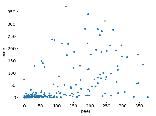
# comapre with scatter plot
drinks.plot(kind="scatter", x="beer", y="wine");
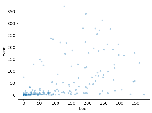
# add transparency
drinks.plot(kind='scatter', x="beer", y="wine", alpha=0.3);
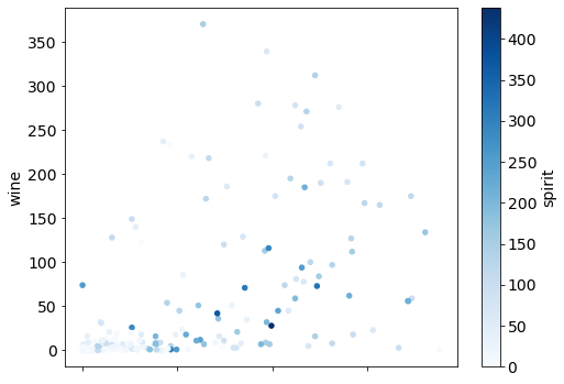
# vary point color by spirit servings
drinks.plot(kind="scatter", x="beer", y="wine", c="spirit", colormap="Blues");
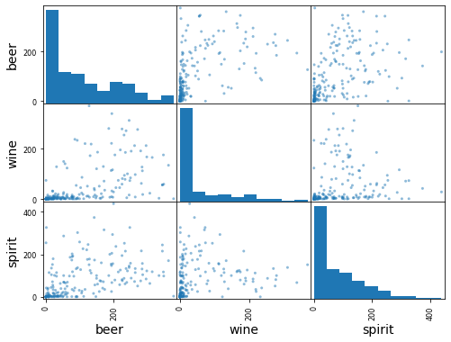
# scatter matrix of 3 numerical columns
pd.plotting.scatter_matrix(drinks[['beer', 'wine', 'spirit']]);
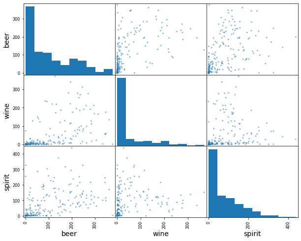
# increase figure size
# scatter matrix of 3 numerical columns
pd.plotting.scatter_matrix(drinks[['beer', 'wine', 'spirit']], figsize=(10,8));
Bar Plot: show a numerical comparison across different categories
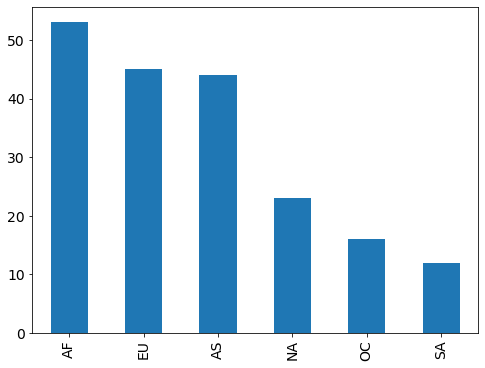
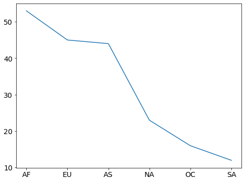
# count the number of countries in each continent
drinks.continent.value_counts()
AF    53
EU    45
AS    44
NA    23
OC    16
SA    12
Name: continent, dtype: int64
# compare with bar plot
drinks.continent.value_counts().plot(kind="bar");
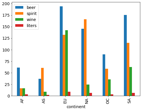
# calculate the mean alcohol amounts for each continent
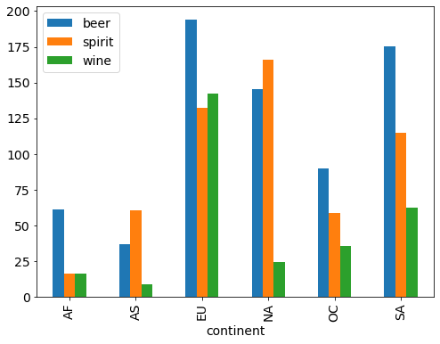
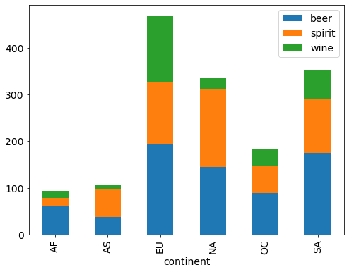
drinks.groupby('continent').mean()
| beer | spirit | wine | liters | |
|---|---|---|---|---|
| continent | ||||
| AF | 61.471698 | 16.339623 | 16.264151 | 3.007547 |
| AS | 37.045455 | 60.840909 | 9.068182 | 2.170455 |
| EU | 193.777778 | 132.555556 | 142.222222 | 8.617778 |
| NA | 145.434783 | 165.739130 | 24.521739 | 5.995652 |
| OC | 89.687500 | 58.437500 | 35.625000 | 3.381250 |
| SA | 175.083333 | 114.750000 | 62.416667 | 6.308333 |
# side-by-side bar plots
drinks.groupby('continent').mean().plot(kind='bar');
# drop the liters column
drinks.groupby('continent').mean().drop('liters', axis=1).plot(kind='bar');
# stacked bar plots
drinks.groupby('continent').mean().drop('liters', axis=1).plot(kind='bar', stacked=True);
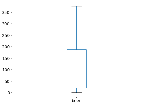
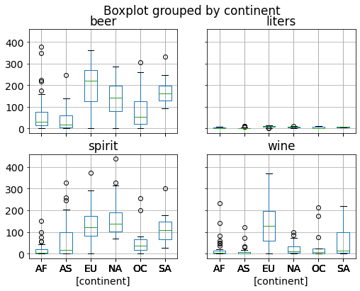
Box Plot: show quartiles (and outliers) for one or more numerical variables
Five-Number Summary
min = minimum value
5% = first quartile (Q1) = median of the lower half of the data
50% = second quartile (Q2) = median of the data
75% = third quartile (Q3) = median of the upper half of the data
max = maximum value (More useful than mean and standard deviation for describing skewed distributions)
Interquartile Range (IQR) = Q3 - Q1
Outliers
below Q1 - 1.5 * IQR
above Q3 + 1.5 * IQR
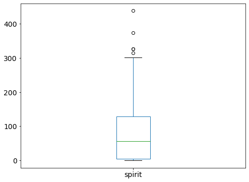
# sort the spirit column
drinks.spirit.sort_values().values
array([  0,   0,   0,   0,   0,   0,   0,   0,   0,   0,   0,   0,   0,
         0,   0,   0,   0,   0,   0,   0,   0,   0,   0,   1,   1,   1,
         1,   1,   1,   1,   1,   1,   2,   2,   2,   2,   2,   2,   2,
         3,   3,   3,   3,   3,   3,   3,   3,   4,   4,   4,   5,   5,
         6,   6,   6,   7,   9,  11,  11,  12,  13,  15,  15,  16,  16,
        18,  18,  18,  18,  19,  21,  21,  22,  22,  25,  25,  27,  29,
        31,  31,  34,  35,  35,  35,  35,  38,  39,  41,  41,  42,  42,
        44,  46,  50,  51,  55,  56,  57,  60,  61,  63,  63,  65,  67,
        68,  69,  69,  69,  71,  71,  72,  74,  75,  76,  76,  79,  81,
        84,  87,  87,  88,  97,  97,  98,  98, 100, 100, 100, 100, 101,
       104, 104, 112, 114, 114, 114, 117, 117, 118, 118, 122, 122, 124,
       126, 128, 131, 132, 133, 133, 135, 137, 138, 145, 147, 151, 152,
       154, 156, 157, 158, 160, 170, 173, 173, 176, 178, 179, 186, 189,
       192, 194, 200, 202, 205, 215, 215, 216, 221, 226, 237, 244, 246,
       252, 254, 258, 286, 293, 302, 315, 326, 326, 373, 438])
# show five-number summary of spirit
drinks.spirit.describe()
count    193.000000
mean      80.994819
std       88.284312
min        0.000000
25%        4.000000
50%       56.000000
75%      128.000000
max      438.000000
Name: spirit, dtype: float64
# compare with boxplot
drinks.spirit.plot(kind='box');
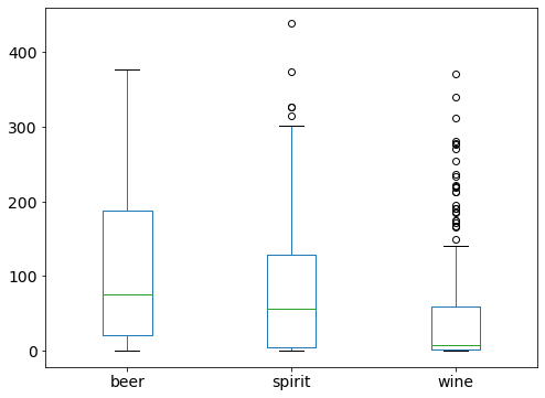
# include multiple variables
drinks.drop('liters', axis=1).plot(kind='box');
Line Plot: show the trend of a numerical variable over time
# read ufo data
ufo = pd.read_csv("../data/ufo.csv")
ufo['Time'] = pd.to_datetime(ufo.Time)
ufo['Year'] = ufo.Time.dt.year
# examine first few rows
ufo.head()
| City | Colors Reported | Shape Reported | State | Time | Year | |
|---|---|---|---|---|---|---|
| 0 | Ithaca | NaN | TRIANGLE | NY | 1930-06-01 22:00:00 | 1930 |
| 1 | Willingboro | NaN | OTHER | NJ | 1930-06-30 20:00:00 | 1930 |
| 2 | Holyoke | NaN | OVAL | CO | 1931-02-15 14:00:00 | 1931 |
| 3 | Abilene | NaN | DISK | KS | 1931-06-01 13:00:00 | 1931 |
| 4 | New York Worlds Fair | NaN | LIGHT | NY | 1933-04-18 19:00:00 | 1933 |
# observations and columns
ufo.shape
(80543, 6)
# data structure
ufo.info()
<class 'pandas.core.frame.DataFrame'>
RangeIndex: 80543 entries, 0 to 80542
Data columns (total 6 columns):
 #   Column           Non-Null Count  Dtype
---  ------           --------------  -----
 0   City             80496 non-null  object
 1   Colors Reported  17034 non-null  object
 2   Shape Reported   72141 non-null  object
 3   State            80543 non-null  object
 4   Time             80543 non-null  datetime64[ns]
 5   Year             80543 non-null  int64
dtypes: datetime64[ns](1), int64(1), object(4)
memory usage: 3.7+ MB
# numerical summary
ufo.describe()
| Year | |
|---|---|
| count | 80543.000000 |
| mean | 2004.178737 |
| std | 10.602487 |
| min | 1930.000000 |
| 25% | 2001.000000 |
| 50% | 2007.000000 |
| 75% | 2011.000000 |
| max | 2014.000000 |
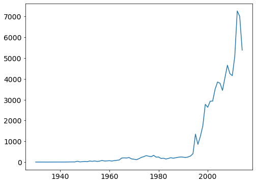
# count the number of ufo reports each year (and sort by year)
ufo.Year.value_counts().sort_index()
1930       2
1931       2
1933       1
1934       1
1935       1
        ...
2010    4154
2011    5089
2012    7263
2013    7003
2014    5382
Name: Year, Length: 82, dtype: int64
# compare with line plot
ufo.Year.value_counts().sort_index().plot();
# don't use a line plot when there is no logical ordering
drinks.continent.value_counts().plot(kind='line');
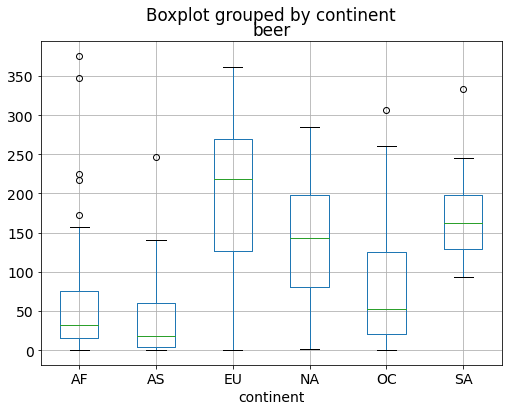
Grouped Box Plots: show one box plot for each group
# remainder: boxplot of beer survings
drinks.beer.plot(kind='box');
# boxplot of beer survings group by continent
drinks.boxplot(column='beer', by='continent');
# boxplot of all numerical columns group by continent
drinks.boxplot(by='continent');
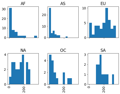
Grouped Histograms: show one histogram for each group
# remainder: histogram of beer survings
drinks.beer.plot(kind='hist', bins=20);

# histogram of beer  survings group by continent
drinks.hist(column='beer', by='continent');
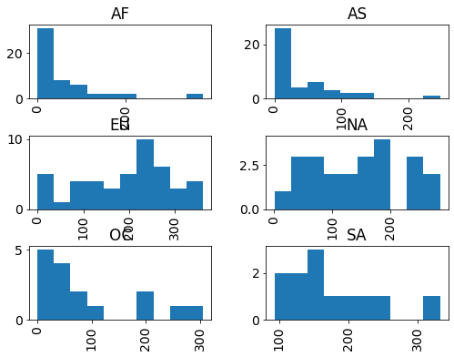
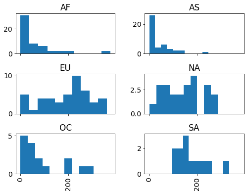
# share the x-axis
drinks.hist(column='beer', by='continent', sharex=True);
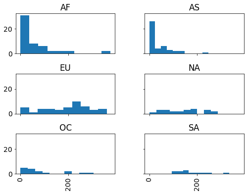
# share the x and y axis
drinks.hist(column='beer', by='continent', sharex=True, sharey=True);
# change the layout
drinks.hist(column='beer', by='continent', sharex=True, layout=(2, 3));
Assorted Functionality
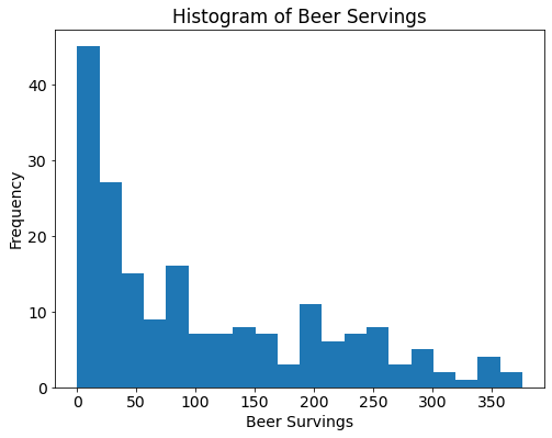
# saving a plot to a file
drinks.beer.plot(kind='hist', bins=20, title="Histogram of Beer Survings")
plt.xlabel("Beer Survings")
plt.ylabel("Freequency")
plt.savefig("beer_survings.png") # .png, .tiff, .pdf, .jpeg
# list available plot style
plt.style.available
['Solarize_Light2',
 '_classic_test_patch',
 'bmh',
 'classic',
 'dark_background',
 'fast',
 'fivethirtyeight',
 'ggplot',
 'grayscale',
 'seaborn',
 'seaborn-bright',
 'seaborn-colorblind',
 'seaborn-dark',
 'seaborn-dark-palette',
 'seaborn-darkgrid',
 'seaborn-deep',
 'seaborn-muted',
 'seaborn-notebook',
 'seaborn-paper',
 'seaborn-pastel',
 'seaborn-poster',
 'seaborn-talk',
 'seaborn-ticks',
 'seaborn-white',
 'seaborn-whitegrid',
 'tableau-colorblind10']
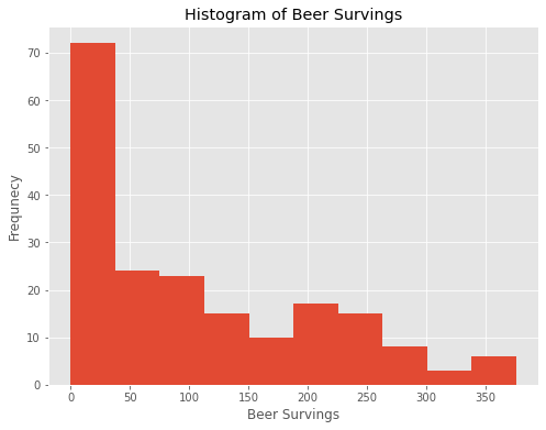
# use plot style: ggplot
plt.style.use('ggplot')
# histogram of beer survings in ggplot style
drinks.beer.plot(kind="hist", title="Histogram of Beer Survings")
plt.xlabel("Beer Survings")
plt.ylabel("Frequnecy")
Text(0, 0.5, 'Frequnecy')
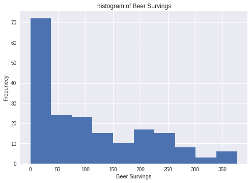
# use plot style: ggplot
plt.style.use('seaborn')
# histogram of beer survings in seaborn style
drinks.beer.plot(kind="hist", title="Histogram of Beer Survings")
plt.xlabel("Beer Survings")
plt.ylabel("Frequnecy")
Text(0, 0.5, 'Frequnecy')
# use plot style: ggplot
plt.style.use('fivethirtyeight')
# histogram of beer survings in fivethirtyeight style
drinks.beer.plot(kind="hist", title="Histogram of Beer Survings")
plt.xlabel("Beer Survings")
plt.ylabel("Frequnecy")
Text(0, 0.5, 'Frequnecy')